


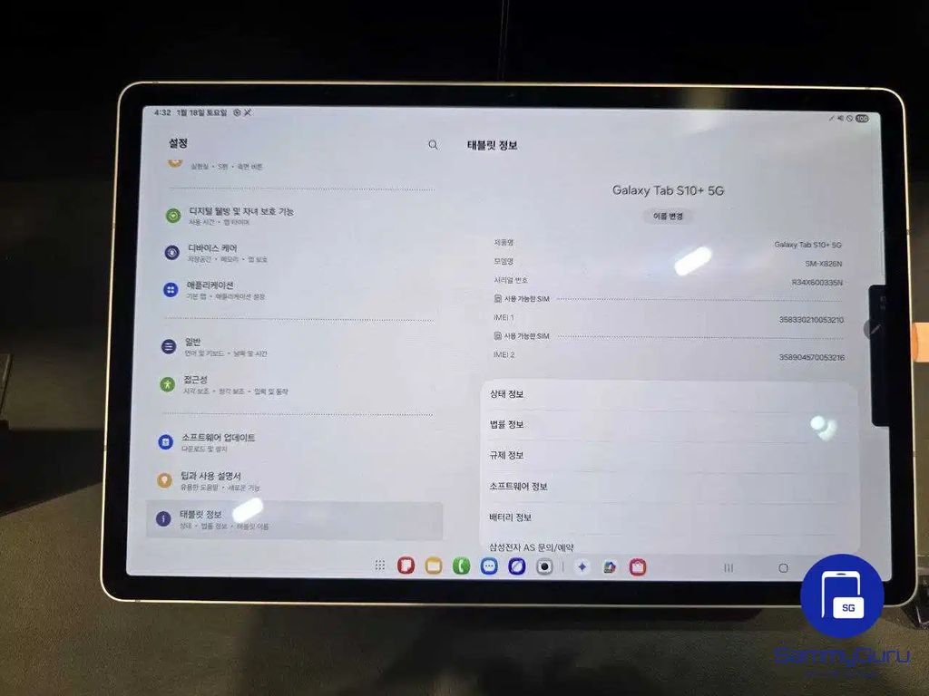
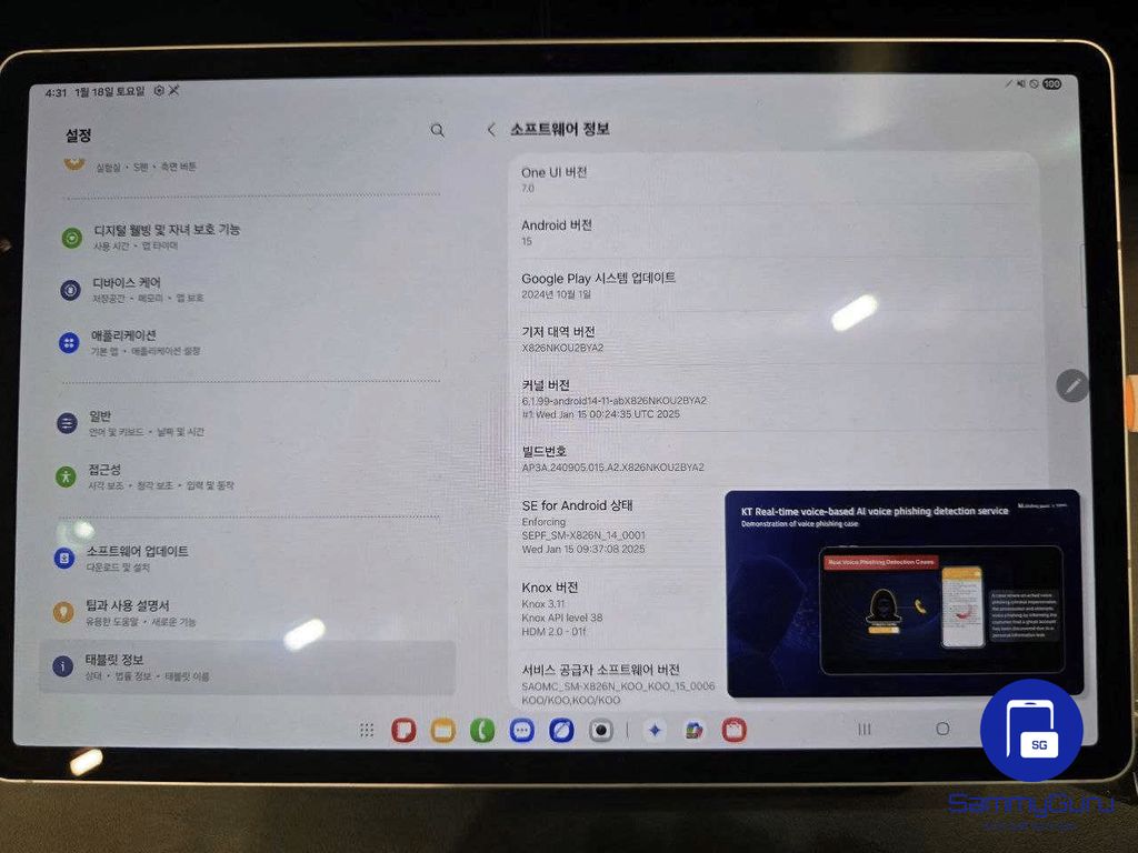
Igeekphone, March 7 news, technology media sammyguru yesterday (March 6) published a blog post, sharing the Samsung Galaxy Tab S10 Ultra and Galaxy Tab S10+ two tablets, adapted to upgrade One UI 7.0 interface photos, Showcasing a new design language and functional optimizations.
New Quick Settings panel
The Quick Settings panel of One UI 7.0 is available for large-screen devices for the first time. Compared to the mobile version, the options on the tablet are wider, making full use of landscape space.
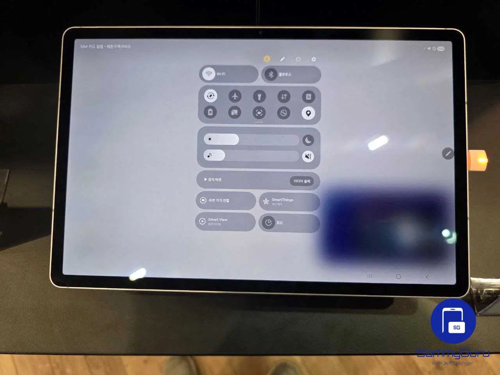
The interface uses a full-screen blur effect and eliminates the container design in One UI 6.1. Images of the Notification Shade and Combined view have not yet been released, but the overall layout is centered and simple and intuitive.
Galaxy Tab S10 + home screen design
Judging from the exposed images, the home screen design of One UI 7.0 is more compact. While only six apps are currently on display, the new version is likely to continue the eight-column grid layout of One UI 6.1, and introduce new widgets to improve the user experience.
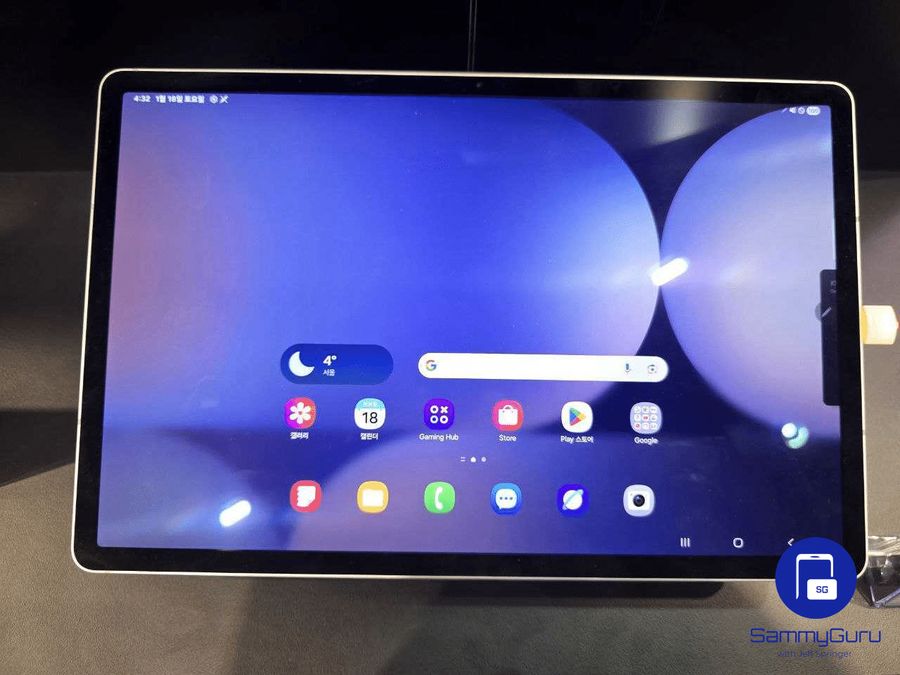
Overall user interface optimization
The One UI 7.0 interface design on the Galaxy Tab S10 Ultra and Tab S10 + is more detail-oriented. The title font is bold, the left category icon is designed with rounded corners, and the icon under the Galaxy AI is also refreshed.
In addition, the battery icon in the status bar is designed more rounder, in line with the Beta 3 version of the Galaxy S24 series, and these details show that Samsung has maintained a high degree of consistency in the design.