


Igeekphone News, November 24th. On November 22nd local time, according to the foreign media 9to5Google, after the initial release of Material 3 Expressive, Google has recently redesigned the menu to conform to the latest language.
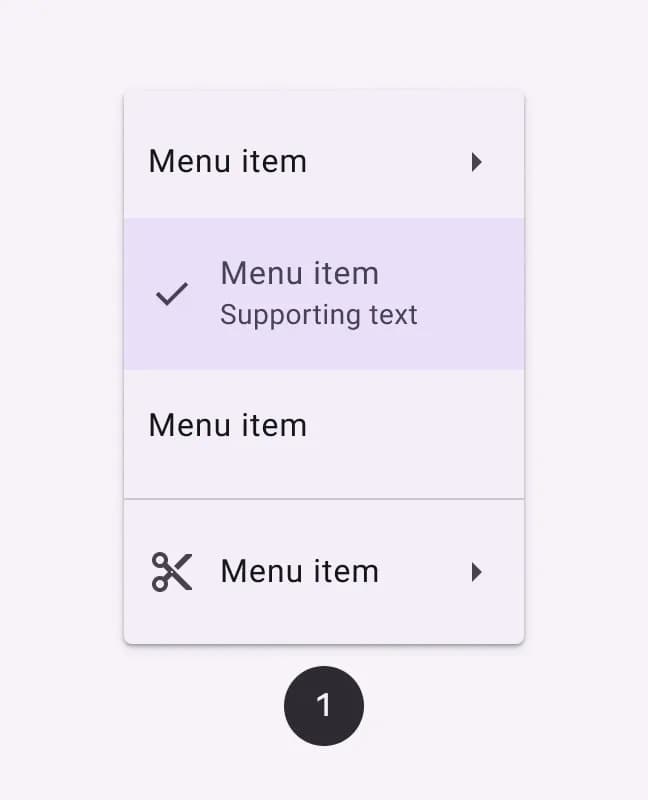
The M3 Expressive has newly added the “Vertical Menu”, featuring new shape and color styles, as well as selection status and optimized submenu animation effects. Compared with the previous “Basic Menu”, the corners of the new menu are more rounded, and the divider lines and the currently selected items no longer occupy the entire width of the container.
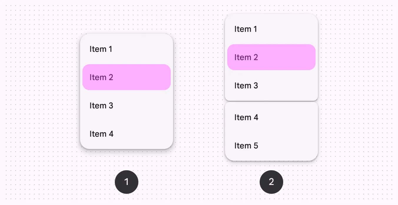
Google has also launched the “with gap” option, which can be used in combination with the “with divider” option, thereby providing a more flexible layout for the Android system and achieving a clearer separation effect. The gap here can assist in “categorizing similar operations”, which is more expressive than the separator and can clearly show the relationship between items. The user guide includes:
Avoid changing the size of the gap
The gap in each menu should not exceed one or two
Do not use gaps in scrollable menus
In terms of color style, the effect of the “Vitality Menu” is more prominent than that of the “Standard Menu”, and Google also suggests that it should be used with caution.
Standard: Based on the surface, with low visual emphasis
Vitality: Based on the third color, it has a relatively high visual emphasis
The menu pairs well with the new split button. The shape changes of ME3 can make the corners of the focused sub-menus more rounded and the unfocused sub-menus smoother, bringing a sense of dynamics to the menu interaction.
According to Igeekphone, at the 2025 I/O Conference, Google released five new phenotypic components: button groups, FAB menus, load indicators, split buttons, and toolbars, and updated a large number of existing components: Buttons, extended FAB, FAB, icon buttons, progress indicators, navigation bars, navigation tracks, application bars, menus, sliders and toolbars.